


The Story Behind my Book Cover
And how we DO judge a book by its cover

Writing non-fiction history can, like most projects, be a Herculean task.
The process can often take many years, from the initial germ of an idea to producing a thorough book proposal that outlines your vision, the months it can take to engage and attract a publisher, the legal dotting the i’s and dotting the t’s before delving deep into hundreds of hours of research, writing, and editing.
Like any protracted mission one embarks on, there are peaks and troughs, moments of great excitement as you stumble across a fascinating snippet of information you get to transform into compelling prose, or feelings of despair as you are, yet again, scrolling through a series of monotonous payment accounts past midnight as a deadline looms, hoping and praying that your efforts will yield a golden nugget.
It is, however, an addictive process that pays off when you first get to tear open the box and hold that freshly printed hardcover for the first time, to run your finger over the cover that bears your name, and the catchy title you bestowed upon your labours. This moment is what all the hard work and lonely hours are about.
When a writer rounds the final corner into the home straight, it’s natural for attentions to turn towards other facets of the writing process, including promotion. One aspect that I hugely look forward to that falls within this category is the concept and design of the front cover.
Now, we’re always told ‘never judge a book by its cover’, which might lead to the belief that when it comes to actual books, covers aren’t that important. Nuh-uh.

When it comes to the promotion and success of a book, the cover is an essential component in attracting readers. With thousands of books in any one bookshop, and many, many more posted across social media, it is imperative the cover captures the essence of the book to potential readers who are making a split-second decision whether to take a closer look – or not.
The cover must offer a compelling first impression, whilst conveying the genre and content. Reader psychology is a well-known concept in the bookselling world. Quite simply, the cover provides a window into the book’s soul and, whether we should or not, we DO judge books by their cover. In fact, book covers have become cherished works of art in themselves.
So, what is (generally), the process behind selecting a cover for the book? Publishers have a wealth of experience to draw on and will generally have some idea of what works and what doesn’t work for each genre. They will need to determine the target audience, the intended retailers, to consider competing titles, market trends and, most importantly, to know what sells.
The design of a cover is very much a collaborative effort, involving in-house graphic designers working to a brief from the editorial and marketing teams, with sales and production perhaps chipping in with their thoughts. Often, publishers will work with the larger retail outlets to garner some further insight into what works and what doesn’t work – it is in everyone’s interest, after all, that a book appeals to the market, and whilst editorial might understand a book’s thematical content, a bookseller will understand the end customer browsing on their lunchtime. The author may also be consulted towards the end of the process and shown a few mock-ups for feedback, though they will rarely have any deciding vote. After various covers meetings are held between the relevant stakeholders and feedback has been actioned where required, a final decision is made.
Now, for my last three books, ‘The House of Beaufort’ (2017), ‘Henry VII and the Tudor Pretenders’ (2021) and ‘Son of Prophecy’ (2024), I developed a good rapport with my editor Alex at Amberley Publishing that allowed me considerable involvement in the concept of the covers, though of course the design of which were handled by the in-house art department who know what they’re doing. There is a reason I am a writer not an artist, after all. But, as the person who has spent years carefully crafting a manuscript, knows the content of the books inside out, and is something of a control freak, who better placed to at least propose some ideas?


For the Beaufort book, I suggested using the restored Beaufort coat of arms that can be found in Southwark Cathedral, a real tangible monument that can be viewed by a reader, and preferential to a glossy render like those found on Wikipedia. Initial designs had blue and red stripes, but on reflection we removed those. On the back, instead of a usual blurb, we opted to go with a large Shakespearean quote that referred to the Beaufort’s Lancastrian loyalism.
For the Pretenders book, I initially requested a cover that was green and white, a nod to the Tudor livery colours (more on which, below). I enlisted the help of a graphic designer friend to come up with some mockups based on my idea that I could take to the publisher – the consensus was that in the market, the cover would not stand out from afar and would not appeal to the casual reader. My editor came to me after an in-house cover meeting with an idea built around a crowned Tudor rose found in a contemporary manuscript. Three rosebuds were included which alluded to the three pretenders mentioned in the book’s subtitle, which I thought was a nice touch. It certainly was a striking cover, and the right call.
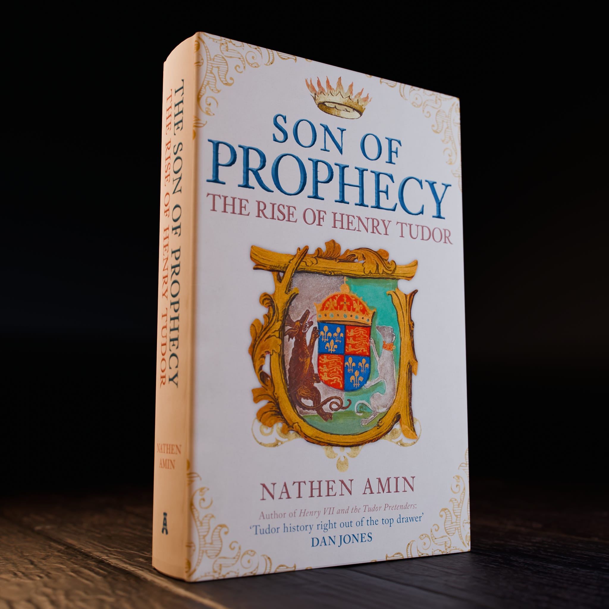
When it came to the Son of Prophecy book, initially there was discussions around using a red dragon, which seemed appropriate considering the content revolves around Henry VII’s Welsh ancestry and his adoption of the red dragon as his own personal badge. The initial cover design was beautiful, but after canvassing a few opinions from friends, family and other authors, it was felt the cover was more fitted to a novel rather than a non-fiction work. Much back and forth with the publishing team resulted in a new direction, one that involved an illustration I came across in a digitised manuscript on the British Library website.

The manuscript in question, designated Harley MS 28 by the British Library, is a 1504 indenture, or agreement, made between Henry VII and John Islip, abbot of Westminster. These illuminated agreements confirmed Henry’s plans to pull down the abbey’s Lady Chapel so that he could rebuild a grander replacement in his vision and set out his requirements for the foundation of a chantry and the distribution of alms for the poor. Several copies of these agreements were made, with surviving and now part of the collections at St Paul’s Cathedral and the Bodleian Library in Oxford.
On the front of the first folio (or page) of the manuscript, the painted border features the Beaufort portcullis on a blue background, and there are a smattering of Lancastrian red roses. In the centre, however, is what captured my attention, a striking depiction of Henry VII’s coat of arms.
Now, every king of England employed the royal arms of the kingdom, which had undergone a few amendments across the centuries. Initially, England’s arms consisted of three golden lions or leopards on a red background, but after Edward III lay claim to the French throne, in 1340 he had these quartered with the French arms, which were golden fleurs-de-lis on a blue background. When Charles V of France reduced the number of fleurs-de-lis on the French arms in 1376, the English kings followed suit on their own arms.
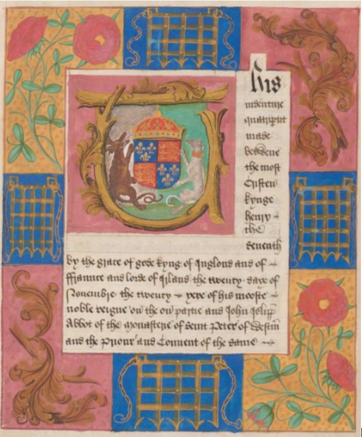
By the time Henry became king in 1485, these arms then, consisted of four sections, with two sections bearing three lions on red, and two sections bearing three fleurs-de-lis on blue. Now, each king of England also selected two supporters, heraldic beasts that appeared either side of the royal arms. These were often personal to the monarch – Richard II, for example, chose two white harts, whilst Henry VI had two white antelopes. Edward IV used two white lions and Richard III famously employed two white boars.
When it came to settling upon a royal badge or emblem to represent him in public, Henry looked to his ancestry for inspiration. For one of his supporters, Henry VII choose a white greyhound with a red and gold collar, a heraldic device associated with the earldom of Richmond and which had connections to the House of Lancaster. Among those who had borne the greyhound as a secondary badge were John of Gaunt and John Beaufort, Henry’s great-great-grandfather and great-grandfather respectively.
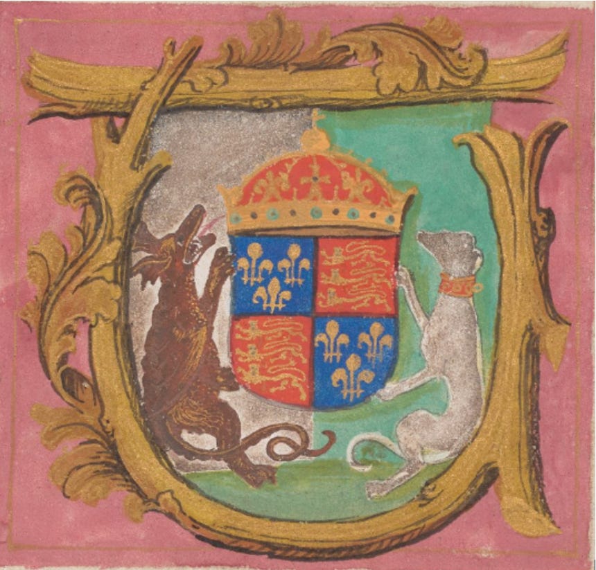
The other supporter he selected was one singularly rooted in Welsh history, but which would become synonymous with the first Tudor king of England, the Red Dragon of Cadwaladr. This mythical beast was recognisable to the medieval Welsh person and associated with Cadwaladr ap Cadwallon, the mid-seventh century king of Gwynedd whom Henry claimed as an ancestor. Dragons had long been used as heraldic symbols in Britain, having been particularly prominent in Roman military circles, with individual units of cohorts typically brandishing depictions of the beast upon a gilded staff. When the Romans withdrew in the fourth century, the dragon, for so long a symbol of power, was retained by the Romanised British populace, who integrated the beast into their own culture.
During his march to face Richard III in battle, Henry had brandished the dragon wherever he went, consciously positioning himself as the successor of the ancient king of the Britons. It likely stirred patriotic feelings towards him from his countrymen. Though he would employ multiple badges throughout his reign, ancestral propaganda that included the red rose of Lancaster and the Beaufort portcullis, when it came to his arms, Henry elected to promote his Welsh lineage.

Perhaps because of insecurity about his legitimacy to rule, and to conceal some of this dynastic vulnerability, Henry projected his family’s emblems like no previous king, consciously branding his kingdom with his arms. Chapels, cathedrals, churches, walls, coins, caparisons, and, of course, manuscripts, were liberally branded with the Tudor dragon and greyhound.
Furthermore, at some point before Henry became king, he adopted the colours green and white as his personal livery colours. Each fifteenth century magnate had distinctive colours which their indentured servants, retainers or followers would wear to broadcast their allegiance to that particular lord – Richard III’s men wore uniforms of murrey and blue for example, the Beauforts had blue and white, and the de Vere family red and yellow. The green and white that Henry now used had lengthy connections with the Welsh, likely dating to the colours born on the French campaigns in the 1346 by the Welsh levies of Edward of Woodstock, the Prince of Wales. Henry’s great-grand uncle Goronwy ap Tudur, meanwhile, was also noted by the poet Iolo Goch of handing out liveries of the finest green to his men.
Either way, Henry used green and white as his colours. In creating his battle standard, which flew above his head during the battle of Bosworth and was later placed reverently upon the altar at St Paul’s to give thanks for victory, Henry combined the red dragon with these two colours, merging ancient Welsh mythology with the Tudor dynasty – those who know anything about modern Wales today will immediately recognise the result.
Which brings us back to the manuscript and why I chose it as the foundation of my book cover. There are plenty of Tudor coat of arms to be found in the manuscripts, because, as mentioned, there was a concerted attempt to brand the Tudor dynasty whenever and wherever possible. In these particular indentures, however, it immediately became apparent to me that there was an attempt to also portray the green and white livery colours of Henry VII, confirmation that these were indeed associated with him.
In one contemporary illustration, therefore, dating to the lifetime of the principal subject of my book, it tells me everything that I strive to convey to the reader throughout the work – Henry’s deep and enduring Welsh roots, and how he was able to mine into Welsh mythology to project himself and his dynasty as the rightful heirs to not only Wales or England, but Britain itself, a concept that would be politically realised under his descendants.
Last year whilst browsing through Westminster Abbey’s Queen’s Diamond Jubilee Galleries, I was stopped in my tracks by one of the indentures, which formed part of the exhibition. Nothing can prepare you for the richness of the ink on a five-hundred-year-old manuscript.
So, there you have the motivation and the process behind the book cover for Son of Prophecy. What do you think, do you like the cover?

Son of Prophecy
'Son of Prophecy: The Rise of Henry Tudor' is a 300-year history of one Welsh family, and how they emerged from the wilds of Gwynedd, navigated the murky and violent waters of Welsh-Anglo politics, and eventually found their way, almost improbably, onto the English throne. This story involves war, treason, escapes and love. How did Owen Tudor fall in love with a widowed queen, and where does the Tudor name even come from? How was Jasper Tudor able to evade capture for so many decades, and what happened to those Princes in the Tower?
Fourteen years in the making, from defiant Welsh rebels to unlikely English kings, this is the story of the Tudors, but not how you know it. A BBC History Magazine 2024 Book of the Year, it is available to buy worldwide now HERE
Really interesting and the design looks as it should, as an old beautiful manuscript with Henry's arms etc. The first design looked a bit too Game of Thrones, this tells us who Henry was. With the portcullis as well Margaret Beaufort is represented. Love this design. It's perfect and it's eye catching. It tells a story in itself. Beautiful design. Great choice.
*Thank you* for this discussion of book cover design, and particularly your elucidation of the origins of and reasons for the heraldic choices made by kings and lords long ago that still hold meaning to us today.
Indeed, the lush colors of the old manuscripts delight us, even centuries later. When I was in school, we traveled to New York City to Metropolitan Museum of Art. I particularly enjoyed the medieval building’s collection. T. H. White’s _The Once and Future King_ , and _Robin Hood_ were ideological foundational books. And let’s face it, “Right defeats Might, and “Take from the rich and give to the poor“ are not such bad political and practical ideals!))
Anyway, a story that you’ll appreciate: when I traveled to Australia, I was so pleased to be able to see a genuine copy of the Magna Carta in the Parliament building in Canberra. What a treat for a historian to peer at its text and seal. Tres cool!
Come to find out, the Aussies were fortunate enough to have purchased it before its authentication, so they got something of a deal. The British wanted it back, but the Aussies replied in their charming accent, “Naw, this is ours, fair and square, mate.” It had been discovered during the renovation of a castle, when one of the canopy beds built against a wall was dismantled. It had been hidden centuries earlier in the wooden support structure of the bed.